This content is protected against AI scraping.
Creating a tabletop RPG involves countless decisions players never see – from writing rules to balancing mechanics to laying out the final document. Recently, I documented one phase of this: transforming Godflesh: Cycle of Inheritance from raw text into a polished quickstart ready for public playtesting.
This layout session, streamed online, shows the real work behind creating the Chrysalis Quickstart. After two and a half years developing the game’s mechanics and world, it was time to build something players could actually hold and use.
Switching to Affinity Publisher
The session started with a tool change: dropping Adobe InDesign for Affinity Publisher. After more than a decade with Creative Cloud, the endless price negotiations and subscription renewals had become exhausting. Affinity’s one-time purchase model – buy once, get updates until the next major version – was a genuine relief.
The transition was smoother than I expected. Affinity Publisher handles several things more intuitively than InDesign. Preview and work mode switching feels seamless, auto-centering works well, and text flow visualisation gives immediate feedback about document structure. For RPG layout, it fits my workflow while cutting the subscription cost entirely.
Rethinking move design
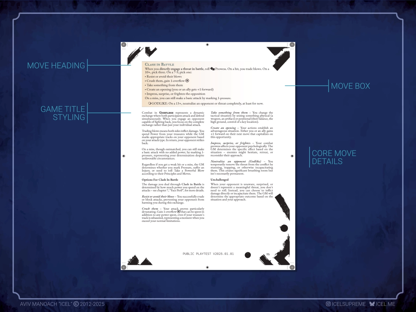
The core challenge was redesigning how game moves appear on the page. My original text frame styles were clumsy and inconsistent across pages. The fix came through paragraph styles, which gave much better flexibility and made maintaining consistency throughout the document significantly easier.
Drawing on Masks: A New Generation for visual reference, I developed a system that fits the game’s fantasy atmosphere. This meant using Font Awesome icons and custom bullet points that feel subtly archaic rather than clinical – balancing fantasy aesthetics with modern readability.
A few key decisions drove the formatting. Gradient backgrounds with careful transparency provide emphasis without drowning the text. Custom character styles handle move triggers and recurring elements consistently. Font Awesome glyphs represent dice, power symbols, and core mechanics, giving the document a consistent visual language.
Affinity Publisher made some of this easier than InDesign would have. Creating gradient effects and managing character styles both felt more natural – which means the tool switch delivered practical benefits beyond cost savings.
Hunting missing rules
Midway through layout, focus shifted to rule completeness – less glamorous, but essential for a playable quickstart. Condensing a full game into a streamlined format inevitably loses information during restructuring.
A few significant gaps turned up. XP rules had disappeared during chapter reorganisation, leaving players without advancement guidance. “Overflow power” appeared throughout moves but was never properly defined. Cross-references between character creation and faction systems needed strengthening. Session moves needed proper formatting and integration with end-of-chapter procedures.
This kind of detective work matters because players need rules that actually function, not just layouts that look good. Working on the assumption that most playtesters would already know PbtA games, I focused on what makes Godflesh different rather than explaining the genre from scratch.
Character creation complexity
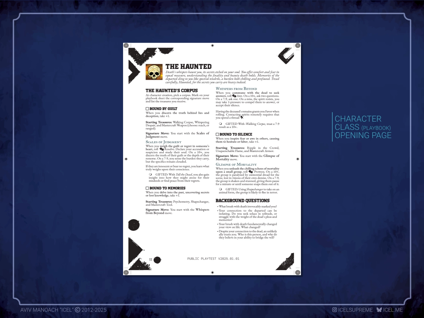
The Create a Character chapter needed a different approach than the core rules sections. Character creation is a step-by-step process that benefits from numbered lists and clear visual hierarchy. Key concepts like attunement – determining how much power characters channel through their treasures – needed special emphasis to ensure players understood them before hitting the character sheet.
Research helped here. Studying how Masks: A New Generation and Root present character options provided useful templates. Both games help players understand what’s available before diving into detailed creation – essential when Godflesh has nine distinct adventurer playbooks to choose from.
The work also revealed a content gap. The Fable playbook was layout-ready but missing advanced moves, and I realised I needed a “roster” overview page first – something players can read to understand all their options and how they differ before committing to a playbook. That meant planning additional content development alongside the layout itself.
Technical challenges
The final phase was preparing the document for distribution, which meant working through Affinity Publisher’s export and bookmark systems. Software limitations have a way of appearing exactly when you need specific features.
Export functionality was solid. High-quality PDF export handles digital distribution well, maintaining crisp text and graphics at any zoom level. Table of contents generation works but operates differently than expected, requiring workflow adjustments. Bookmark creation through anchors functions adequately but feels less intuitive than InDesign’s approach.
One clear limitation: unlike InDesign, you can’t drag-and-drop to reorganise bookmarks. You have to plan your anchor hierarchy from the start. For complex documents with nested sections, that requires more upfront thinking. For a one-time purchase tool, Publisher handles the essentials well while delivering substantial cost savings.
Key development insights
A few things became clear through this session. Being willing to change tools matters – moving to Publisher unlocked both cost savings and a workflow that actually suited the project. Time spent learning the software paid back immediately.
Iteration is unavoidable in layout work. Elements that look right in isolation often need adjustment when you see them in context. Visual hierarchy, spacing, and emphasis require constant re-evaluation. And content completeness is as important as visual design – an attractive layout is useless if the rules don’t work. The layout process itself revealed content gaps that pure writing had missed.
Planning saves time. Establishing consistent character styles early prevents hours of later reformatting. Studying how other successful RPGs solve similar presentation problems provides starting points rather than requiring you to figure everything out from scratch.
Current status and next steps
By the end of the session, the Chrysalis Quickstart foundation was in place. The document exports cleanly, the visual hierarchy reads clearly, and the core systems are properly formatted. It’s deliberately unpolished – this is a working beta designed to capture feedback, not a final product.
Perfection wasn’t the goal. I needed something functional enough to show how the game works – something players could use to understand the mechanics, feel the setting’s atmosphere, and see how their characters operate in a world of fallen gods and divine transformation.
The next development phase will complete the playbook introductions and individual character sheets, which present different layout challenges: character options, advancement tracks, and interconnected systems that make each adventurer type distinct.
Why share this process
Documenting this work serves a few purposes. For indie creators, it shows what professional-looking layout actually requires in terms of time and iteration. For Affinity Publisher users, it provides practical workflow examples and honest assessments of the tool’s limits. For RPG enthusiasts, it reveals how design decisions shape the playing experience.
The finished product hides the messy process behind it. Showing the actual work – including dead ends, tool limitations, and pragmatic solutions – helps anyone approaching a similar project with more realistic expectations.
Every formatting decision, every tracked-down missing rule, every visual tweak contributes to what players eventually experience. Layout serves two purposes: making the game functional and making it beautiful. Both matter equally.
Godflesh: Cycle of Inheritance is a tabletop RPG about mortals ascending to godhood in a world shaped by divine power and transformation. The public playtest is now available.